Showing posts with label OUGD201-packaging. Show all posts

Monday, 22 November 2010

Today ive been looking at packaging and how it works getting into the mind of the designer and begining to think how thins are done and potentially printed.


 The childrens packaging here interesting bright colours-expensive to print so dont buy the bottle this colour! how it works as a range fun for children front of product head dinosaur back the tail of dinosaur. be printing on a sticky cellophane and cut added to bottle/ pad printed onto it.

 Jam jars have the feel that there home made expensive feel just printed stickers for these 4 colour print


 Cravendale- milk? really ive never seen these type of designs on the cartons i think they have gone for a more objective fel recently with cows on the front! yet nice design simple each box has used duotones..


  think for packaging this cream is far too complex unsure where i shold be looking or what the product is?? possibly a hexographic print as there are a few very bright colours here!

 Simple and whats good about this design is that the photography is very effective within context grow your own and in a pile of seeds standing tall as if it has grown! The illustrations have come out well lovely vibrant colours i belive this to e down to very good software skills! hoping to improve mine.

 Lighthearted packaging again this is a god board you can see a range of products and the final image of it has a net in context. Really explains a story. simple colours black and bright shades and alot of white space. composition looks balanced. offset litho printed.


 I admire the rawness of the image above hand rawn cut out shapes on a recylced texture paper bold colours which are reversed front to back.


 The colours on these simple grey shapes really stand out and appear to be so effective on simple box packaging how design changes the appel of a product wonderful!! litho print die cut
 Printing on bags can be done in two ways screenprint onto ready made bag or print onto stock and hand folded im unsure which would be most cost efficent.
 I put these on here as they are nets to very interesting packages:


Thursday, 28 October 2010

Tea rooms/delecatesants

All the range of teas which are availalable many more than i imagined anyway! Good for a range of tea tags which im looking to produce.


The way tihs box is looks so professional with the insert something which isnt that expensive to achieve printed on tracing paper.


interesting packaging printed on the bag looks like a sack and then stitched this would have been flexo printed then put together afterwards.


Tea packaging

I have began by brainstorming a lot of ideas onto a sheet on my chosen "GOOD" subject which is tea rooms and delecatesants.i have explored many different areas not always thinking of a print medium to begin with. so throughout this design context i am going to dig deeper into all the different sub catergories i have wrote down.. The first of these being tea packaging. I have been thinking about the form of tea and specifically the tea bag once squeeze and seeing how design can effect or add to the action of this. innotave ways to dispose of the bags etc. what materials are used and how companys make a range of products how the packaging changes for this such as colours. i really admire the twining loose early grey packaging i love the use of paper and the layers of it before you reach the product it looks expensive and adds to the want for twinings specialist products.

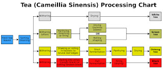
How tea is made.

Look at the chart above. Proccessing chart shows how white and black tea are made.

My initial reason why i have chosen tea.

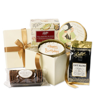
I went into bettys tea room as my initial want for the old vintage tea rooms in harrogate the way yo walk in an the smell of the cafe flooded your nose fresh cakes and the warmth of tea.


Wednesday, 13 October 2010

PACKAGING-ideas for the one week project!


The colours on these packages are bright and illustrative which i love the borders around the types and this is a fine example of making illutrative type look professional on a product


This product holds the packaging together which makes and interaction which is interesting 
This packaging appeals to children i think this because of the use of colours and the way the pages are die cut makes it more interesting the use of simple imagery.