Showing posts with label OUGD202: top ten. Show all posts

Wednesday, 9 February 2011


For this packaging i like the eco friendly rough cardboard which is beautifully protecting the package (book) simple raw and effective.


I dont think ill be using something like this it appears to be more like a package for the mail for a purpose rather than the design.
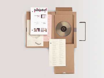
LOVE this!! i like the depth of the box which gives extra room for other deisgn elements such as posters info graphics ect. If i were to use something like this i would possibly add the actual book in which featured on the title sequence.

  BOLD type throughout here which i like and the continuous design through all the elements of packaging which gives consistency and also no matter which side you pul of first you can still see the what the packaging says.
 Simple design concertina fold with space for a dvd 

Friday, 4 February 2011

BBC 2 Ident - Domino - Clean


Looking at idents for BBC two I have noticed that they all contain the large number two in which they try to animate and imatate a real person in order for my idents to relate to this this is what i need to do so im going to play on the 2 interacting with the characters from my stories. they also use very bright backgrounds i will try to experiment with colours to see which works best for my ident.

Channel 4 idents: Construction


Channel 4 idents are so FAB!! the way in which they play with the envoironment and its surroundings are amazing this reminds me of a visual language i had last year looking at planes and angles in which you look at them.

BBC1 Ident - Football


Using local things BBC ONEs idents usually work in a circle shape pattern more about what around us more and more chnnels are doing this so we can realte to them and have more of a WOW factor

BBC Three - Ident - Threefall 2008


I have chosen to show this one as its more illustrative than video and photographic which is what i want to achieve this is digital illustration but i can see how they have done this and feel more confident in what ill be able to achieve with my idents.

Five ident 2009 - World of Five

Friday, 21 January 2011

Sherlock Holmes. End titles


This is probally my favourite title sequence of all time i love the ink splatters and watercolour images i would love to achieve something like this for my work. I love how it gives you a sence of the story violence fighting etc in the titles shows a real story going ahead being washed away and telling a new one. Also a mix media method of working video photographic and illustrative... i want my work to go in this direction in the future. The most frustrating thing is i want to do this for my title sequence yet as im not experienced enough on after effects yet i dont know how!! :-S

Kiss Kiss Bang Bang - Opening credits


I chose to look at these titles as the media used collage is quite unusual and its nice to see old techniques being used in conjunction with new technology is often easy to forget how you started liking doing grpahic design and get lost in fancy new effects on your mac! The colours are so simplistic yet so exciting to watch and wonder what is coming up next i believe the camera and scale have been used in order to pan around the screen to give that exciting element. i want to experiment with these techniques......EXCITED!!

Edward Scissorhands Snowflakes • Opening Credits


I wanted to look at a simple title sequence for a BIG film which everybody knows just to see how you dint need to over complicate things in a title sequence....

Opening Title Credits, Alice


As this is one of the books ive chose to feature in my film i wanted to get some inspiration from what they have already done for the film title sequence.. ive got to say watching these excites me so much pity im RUBBISH on after effects :-( im gettin there though i think... i would like to have another go in the future! - Rabbit animtion is very simplistic not got any features on its face white silohette im going to attempt to achieve this effect.. TYPE traditional script

Good Song - Blur Video


Looking at different techniqques purly illustrative its interesting to watch yet because no colour is a little boring :-(

juno title sequence


LOVE THIS:: simple because its sooo simple and i know how to do this!!!!! :-)) i feel clever again for a moment haha i think after designing all my characters to animate im losing track of what the briefs actually asking me to do and quite frankly its not asking me to do something which i dont know how to!!  im going to incorporate some colour and type using the characters which ive got instead of the solid shape as shown on the juno titles.

Napoleon Dynamite Movie Title


Example of such a simple title sequence background wallpaper cuttings and type over the top a little boring also close to the 50 secs which is how long mine has to be.

Handmade Nation: stop animated opening title sequence


Stop motion title sequence i would love to try this out as collage is something which i like carrying out and to animate it would be fab! the way she has used hand drawn type and things makes this feel really personal touch it also reflects a feel good film in my opinion / a girly chick flick this has also made me consider how your title sequence effects what your going to think about the film and its genre which is going to be important to keep the audience interested.

The Kite Runner Opening Titles


A famous old film yet title sequence never outdates for me i chose to look at this as a like the way the type almost draws itself after having a chat with mike today hes told me its really simple to do this i love these simple effective ways to create imapct... ive been a little worried about doing this now thinking about things i dont need to overcomplicate things to gain maximum effect..

Heavy Petting title sequence


This title sequence appears to be engaging with the audience reminds me of a rhetorical questions its asking the audience and instructing them to fill in the gaps then doing it for us anyway using the dog illustrative gives it a comedy vibe not serious. yet music is very strong and the beat keeps us in line almost.

Where the Wild Things Are Typography Title Sequence


Detailed illustrations in a flip book form yet doesnt look stop motion so been done using layers and then imported into animation program as my illustrations arnt as detailed as these this wouldnt work for me yet the book idea has sparked of a range of ideas for my backgrounds.

Being John Malkovich title sequence


The title sequence for this film is very interesting for me using the camera tool and animating small parts of the designs to make it more intriguing. The way the portraits of the people are on a wall in frames also gives it a sence of context.

Science of Sleep Title Sequence


Watching these title sequences it has shown to me that the importance of them is THE TITLES!! may sound obvious but you soon lose track of the whats important! what goes in around them is just mainly decretive they want you eyes to focus on the names of the people staring in the film as appose to how fancy the graphics are! not much is given away about whats actually going to happen in the film. what a turning point for me!!  things may just start coming together!

Big Fish Title Sequence


I should have started doing my title sequence like this yet when i think of my target audience this really wouldnt have fit in with the age i was going for.. et what this actually does is tell you its a feel good film fun and one which young people will enjoy.. all this ive never seen it :-S hope my analysis was correct!