Bettys tea room has this aura as soon as you walk in of old fashioned as if you were in a sweet shop during the rationing of the war PURE LUXUARY! they way the packaging is just suggests its been around for a while even hpw they display there items on old furniture and in wicker baskets. amazing.

Even where it is situated is gorgeous an old fashioned building when architecture was at its best.
Then we have greggs a fast food well one of the nicest bakeys yet still could be better! the colours scream cheap and simple yet as i have found out not simple all fresh! made on site that day yes a delectesant the same as bettys! and open for just as long...
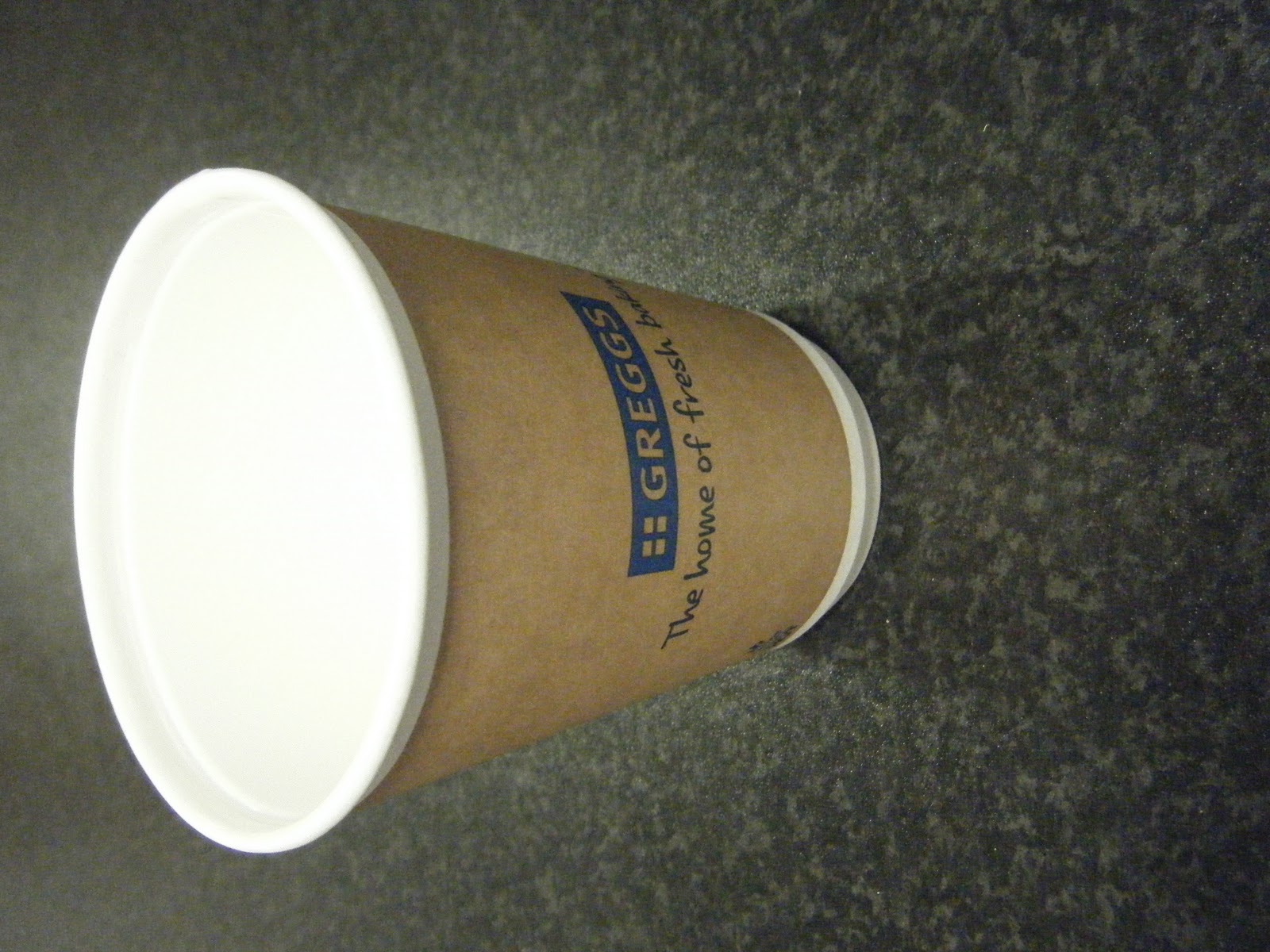
 As i want to rebrand greggs bakery i went into one of there stores in harrogate and asked for one of each of there packages i need to think about storing them when i make my designs they need to lye down flat as these ones do really im trying to make a point about the fact that Bettys a delcatesant which you will see down below has been opened in te 50's as greggs and yet bettys is up to such a high quality and gives this aura of expense i want to take greggs back to its roots and also try and add this vintage family feel to its logo and products.